Unbound Athlete Search
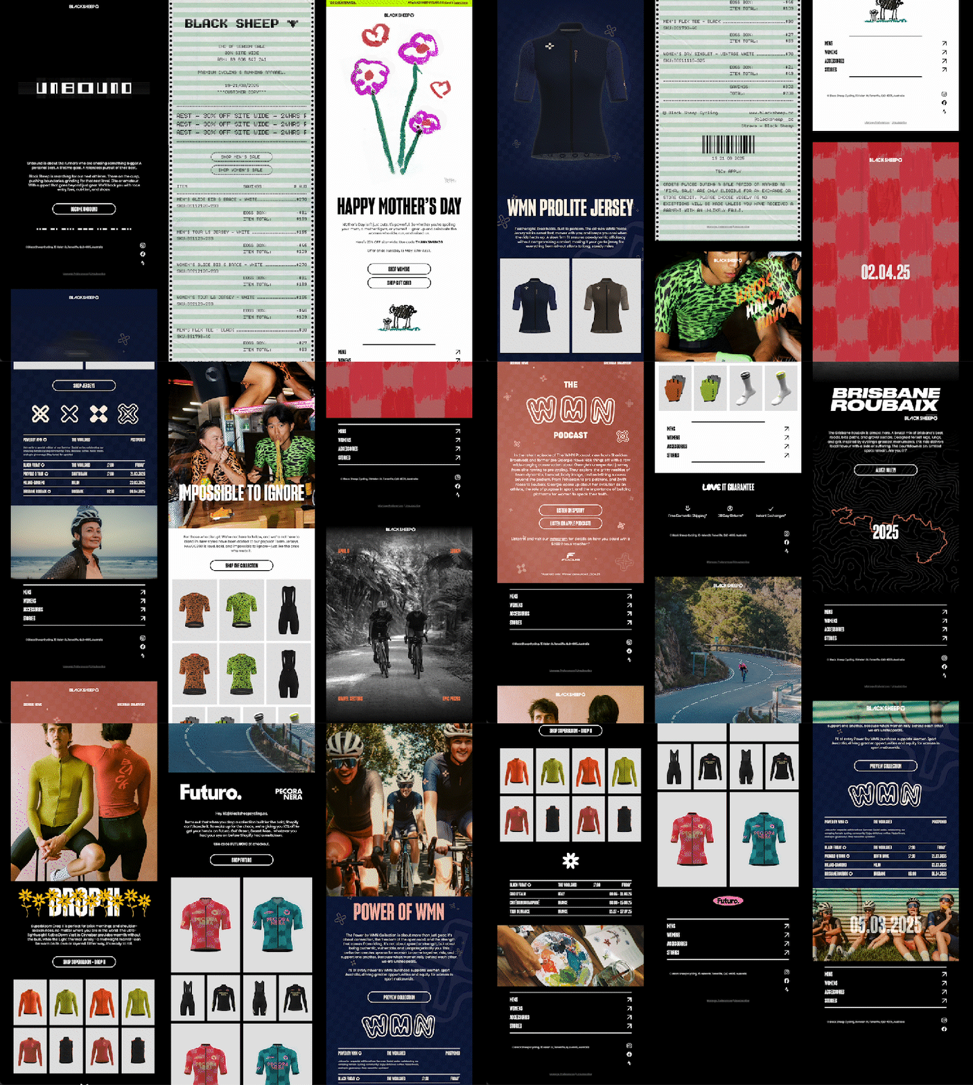
The Unbound Athlete Search features a bold geometric logotype, inspired by the materiality and construction of the Black Sheep Fly Singlet. This evolved into a comprehensive grid system that formed the foundation of the wider visual identity.
Read more...
Feb 2025
Identity
Art Direction
Motion Graphics
Website design
Black Sheep
Solstice Sale
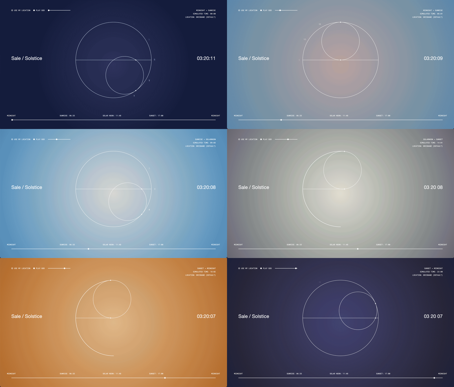
The Solstice Sale featured a toned down visual identity, centered around a singular hero animation of counter-rotating circles. Overlaid on gradients, existing photography and video. This gave the campaign a refined, cohesive look while efficiently showcasing products from collections with distinct concepts.
As part of the campaign, I created a hype and FAQ page with a dynamic, location-responsive gradient background that I both designed and developed.
Read more...
![]()
The Solstice Sale featured a toned down visual identity, centered around a singular hero animation of counter-rotating circles. Overlaid on gradients, existing photography and video. This gave the campaign a refined, cohesive look while efficiently showcasing products from collections with distinct concepts.
As part of the campaign, I created a hype and FAQ page with a dynamic, location-responsive gradient background that I both designed and developed.
Read more...
May 2025
Art Direction Motion Graphics
EDMs
Socials
Website design
Website dev
Black Sheep
Art Direction Motion Graphics
EDMs
Socials
Website design
Website dev
Black Sheep
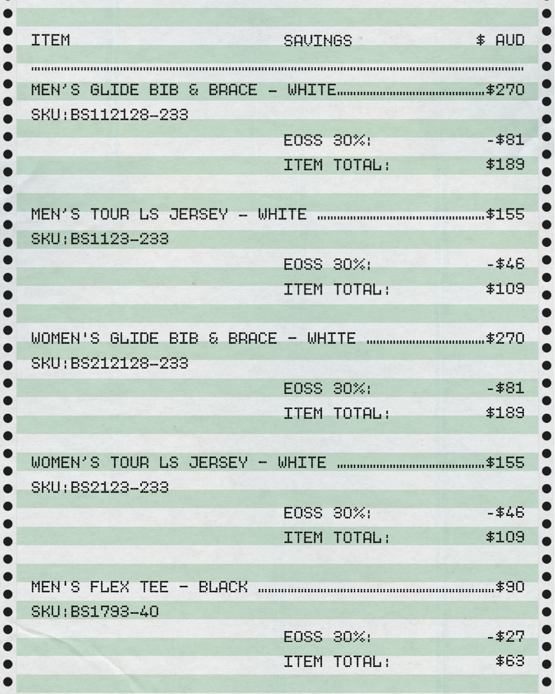
End of Season Sale
In conceiving the EOSS I wanted to be transparent about the transactional nature of sale periods and so I leaned into the receipt motif, rendered in a dot-matrix printer aesthetic. A type-led, systematic layout let me update details efficiently while keeping every asset visually consistent and minimising the need for imagery.
Read more...
![]()
In conceiving the EOSS I wanted to be transparent about the transactional nature of sale periods and so I leaned into the receipt motif, rendered in a dot-matrix printer aesthetic. A type-led, systematic layout let me update details efficiently while keeping every asset visually consistent and minimising the need for imagery.
Read more...
Mar 2025
Art Direction Motion Graphics
EDMs
Socials
Website design
Black Sheep
Art Direction Motion Graphics
EDMs
Socials
Website design
Black Sheep
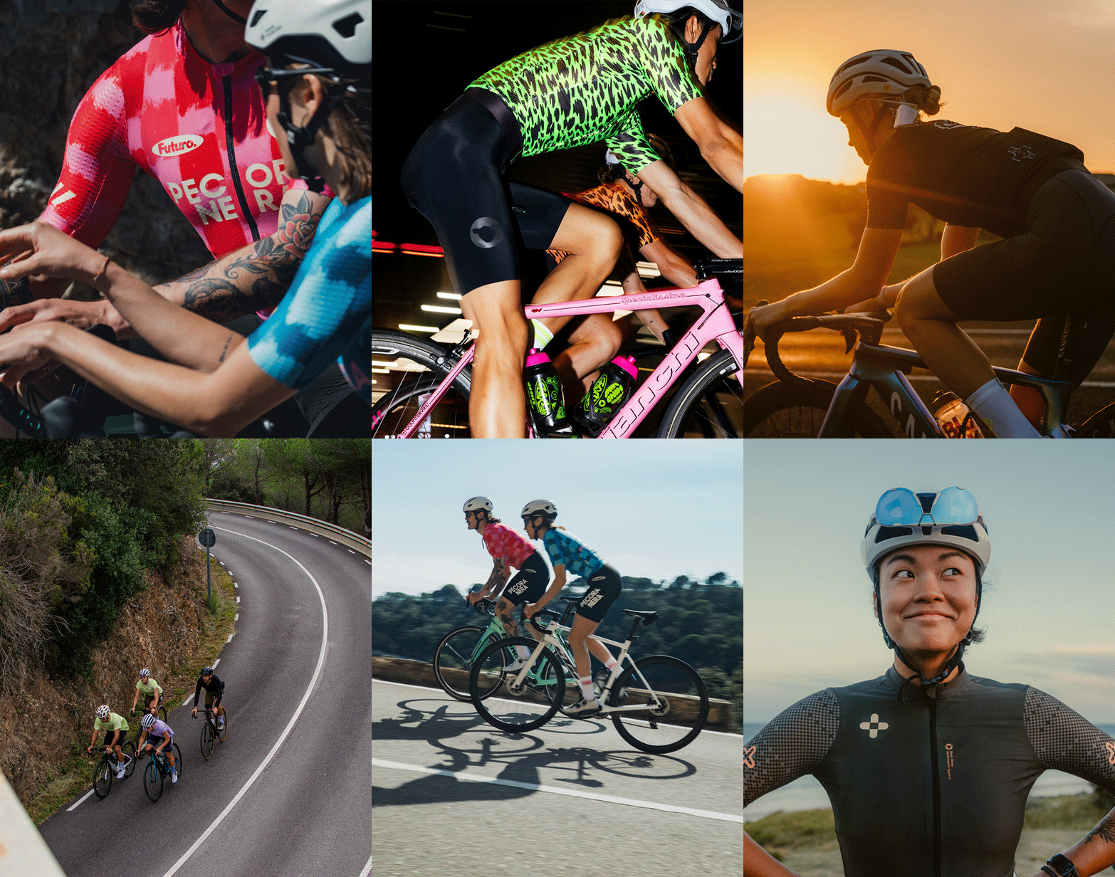
Black Sheep Collections
A selection of works I’ve worked on for collections during my time at Black Sheep.
Read more...
![]()
A selection of works I’ve worked on for collections during my time at Black Sheep.
Read more...
Jan 2025 – Ongoing
Art Direction Motion Graphics
EDMs
Socials
Website design
Black Sheep
Art Direction Motion Graphics
EDMs
Socials
Website design
Black Sheep

Mother’s Day
A campaign celebrating Mother’s Day. Created at short notice, the campaign direction drew inspiration from children’s drawings and the mother-child bond. Drawn by a colleague’s child—Yvette, I opted to provide little guidance on subject matter. Leading to a more honest and genuine drawing.
Read more...
![]()
A campaign celebrating Mother’s Day. Created at short notice, the campaign direction drew inspiration from children’s drawings and the mother-child bond. Drawn by a colleague’s child—Yvette, I opted to provide little guidance on subject matter. Leading to a more honest and genuine drawing.
Read more...
May 2025
Art Direction Motion Graphics
EDMs
Socials
Black Sheep
Art Direction Motion Graphics
EDMs
Socials
Black Sheep
Jan 2025 – Ongoing
Art Direction
Motion Graphics
EDMs
Black Sheep
Art Direction
Motion Graphics
EDMs
Black Sheep
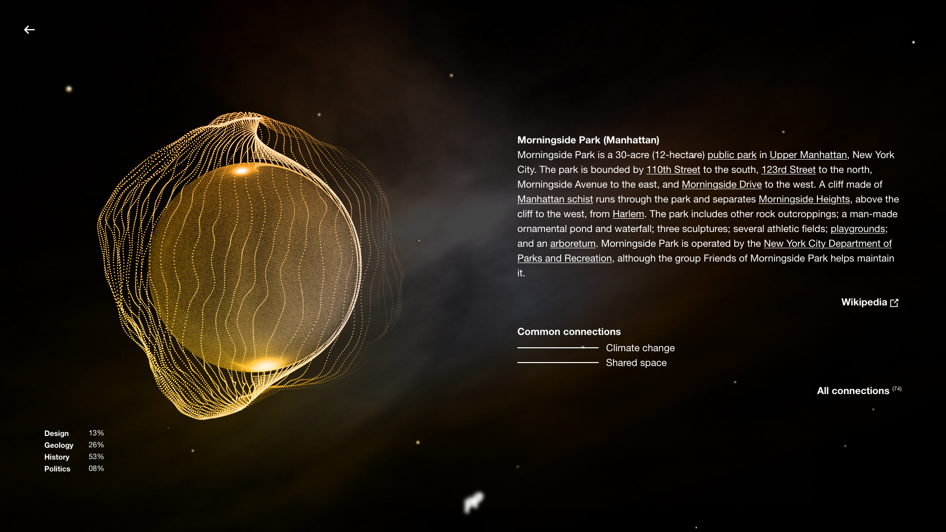
An Ontological Encyclopaedia Concerning the Knowledge and Inspiration Informing My Most Recent Work
There’s a tendency within design fields to be secretive around what influenced your work. The reasons for this are likely many, none of which this book shares. As Anthony Huberman explores in Naïve Set Theory there are numerous ways to create curiosity around your work, almost all of which play a game on the audience. This book is true—everything is contained. The curiosity here is in trying to understand the connections made by another.
Read more...
![]()
There’s a tendency within design fields to be secretive around what influenced your work. The reasons for this are likely many, none of which this book shares. As Anthony Huberman explores in Naïve Set Theory there are numerous ways to create curiosity around your work, almost all of which play a game on the audience. This book is true—everything is contained. The curiosity here is in trying to understand the connections made by another.
Read more...

Jun 2019
Publication Design
Produced for the Making Pages - Contemporary Books and Weird Publishing studio at RMIT
Tutor: Stuart Geddes
Publication Design
Produced for the Making Pages - Contemporary Books and Weird Publishing studio at RMIT
Tutor: Stuart Geddes
Project_Projection
An evolution of the concepts explored in An Ontological Encyclopaedia transposed and scaled infinitely. Project_Projection explores our ever expanding knowledge and defines the liminal space between concepts within human society through visual linkages.
Read more...
View progress of P_P at development diary.
Jan 2020–Ongoing
Information Design
Personal Project
Information Design
Personal Project
Blade Runner Title Sequence
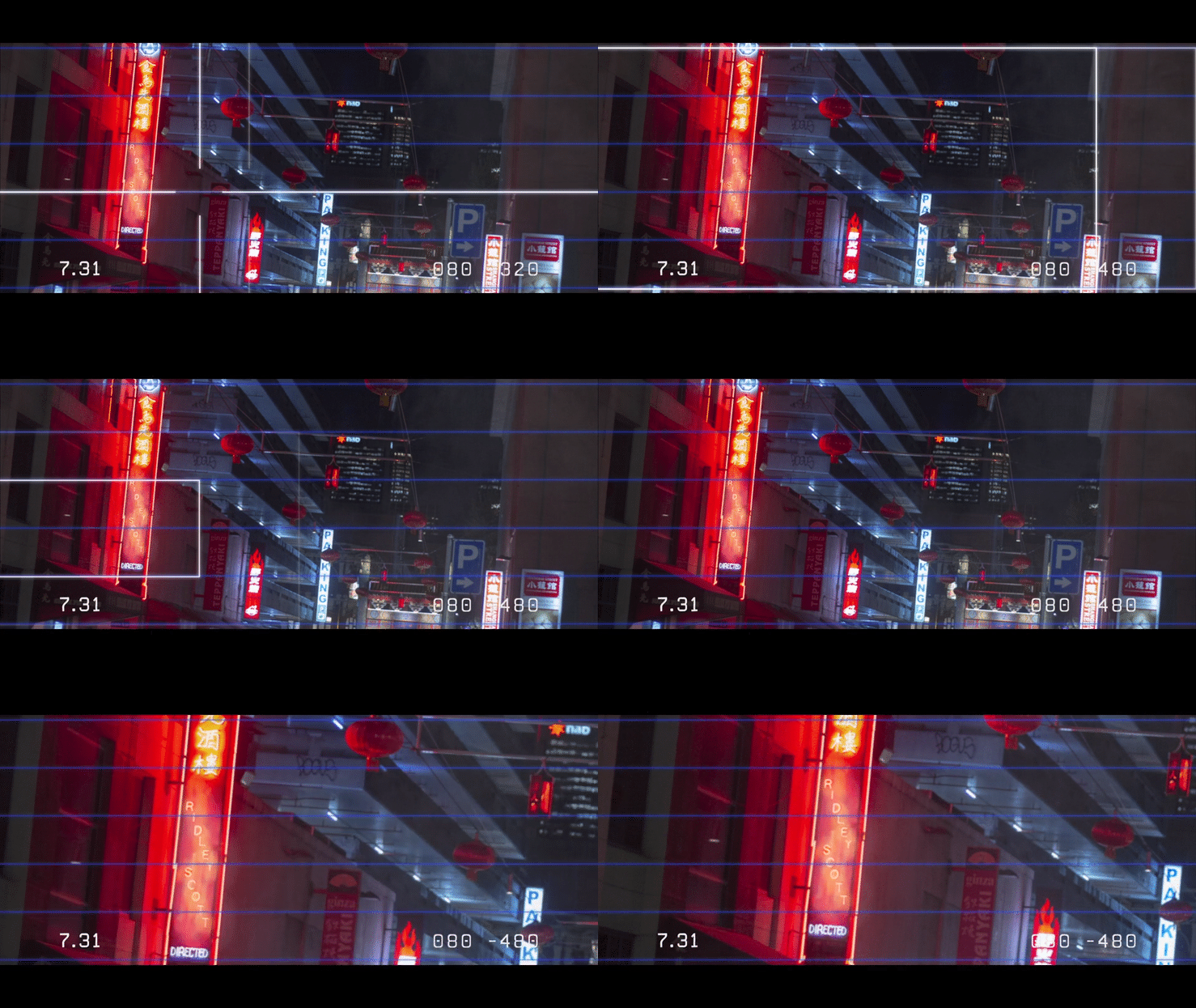
An homage to the iconic Esper photo analysis scene from Blade Runner (1982) these title cards present the actors and key creators in a sequence that is aesthetically and tonally cohesive with Ridley Scott’s original film.
Read more...
An homage to the iconic Esper photo analysis scene from Blade Runner (1982) these title cards present the actors and key creators in a sequence that is aesthetically and tonally cohesive with Ridley Scott’s original film.
Read more...
Apr 2019
Motion Graphics
Workshop: Motion Graphics (RMIT)
Motion Graphics
Workshop: Motion Graphics (RMIT)
Anytime Coffee
My initial involvement with Anytime Coffee was focused on providing technical support for the development of its visual identity and logo. I’m now working to expand and evolve the brand identity. The current work-in-progress project highlights and celebrates the distinct character of the building that Anytime occupies, placing it at the heart of the brand narrative.
Read more...
2020–Ongoing
Identity design
Client: Anytime Coffee
Identity design
Client: Anytime Coffee
semi-circle
Reflecting semi-circle‘s design process, the visual identity necessitated a pared-back, minimal solution. The application of the logo across a diverse range of products and mediums required that it be inherently versatile. Accordingly, the logo takes on two forms to accommodate the ranging specifications of semi-circle’s products.
Read more...
Good Company
Good Company is a cafe located at Scarborough on the Redcliffe Peninsula. The identity and website were designed to reflect the slow days spent on the sun-soaked Australian coast. The direction is intentionally easy-going and simple.
Read more...
Good Company is a cafe located at Scarborough on the Redcliffe Peninsula. The identity and website were designed to reflect the slow days spent on the sun-soaked Australian coast. The direction is intentionally easy-going and simple.
Read more...
Everybody’s Business
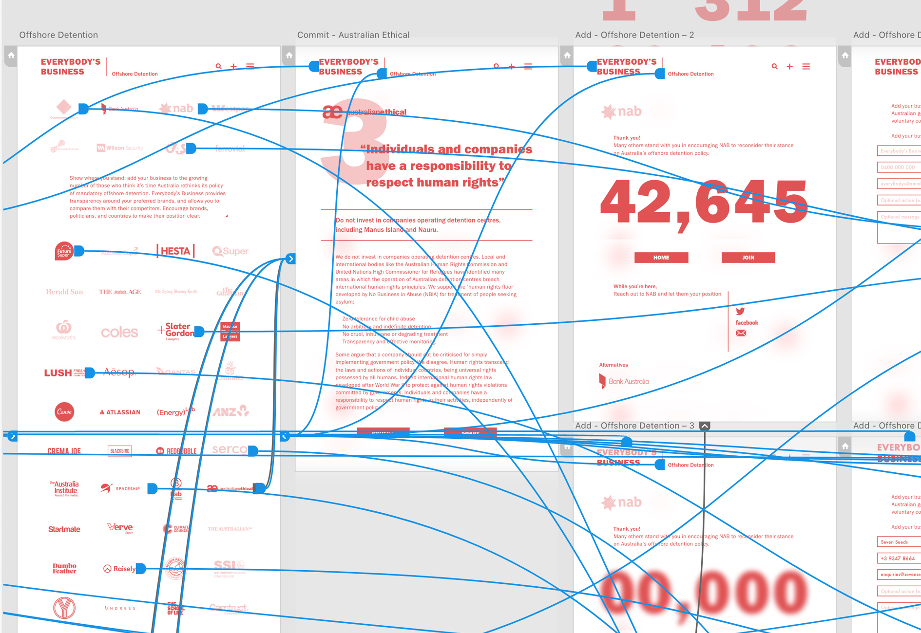
Everybody’s Business is a platform that asks businesses—regardless of size or involvement—to take a stand on political and social issues. Providing transparency for consumers and increasing pressure on the government to reconsider their policy positions. Everybody’s Business is built on the belief that privatisation and deregulation should be accompanied by increased corporate social responsibility.
Read more...
MAY 2018
Social Design UI/UX
Produced for the Free Form studio at RMIT
Tutor: Dan Younger
Social Design UI/UX
Produced for the Free Form studio at RMIT
Tutor: Dan Younger
Spontaneity
Spontaneity was designed as a solution to the epidemic of loneliness, which is more present than ever, despite increased connectedness. Spontaneity aims to overcome the obstacles between you and those who matter most.
Read More...
Spontaneity was designed as a solution to the epidemic of loneliness, which is more present than ever, despite increased connectedness. Spontaneity aims to overcome the obstacles between you and those who matter most.
Read More...
Oct 2018–Ongoing
UI/ UX
Ad Campaign
Produced for the What? A Bloody Waste! studio at RMIT
Tutor: Leigh Whetter
UI/ UX
Ad Campaign
Produced for the What? A Bloody Waste! studio at RMIT
Tutor: Leigh Whetter

